The Truth Behind the Shutter
It is easy to believe that the reason I take photos that people seem to like is because I am constantly loaded up with good photo gear. I’m not going to lie, having good photo gear helps, but Lance Armstrong didn’t win 7 Tour de Frances because he had a nice bike. He even wrote a book to refute such claims called “it’s not about the bike”. I don’t consider myself a particularly good photographer (although I would hazard a guess that Lance Armstrong probably thinks he’s not half bad on a bike), but it has come to my attention that a significant number of my friends disagree with me on that point. Therefore, I am going to explain the technicalities behind some of my favourite photos (don’t forget to click on them) in an effort to debunk this ridiculous notion that somehow I am a talented photographer.
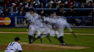
A while back, while living in New York City, I visited the old Yankee Stadium for a Yankees game. Baseball, while I appreciate the way the game works and the impressive skill of its players, is not really my cup of tea, but it does make for some good photos.
I was sitting a reasonable distance away from the pitcher’s mound, in seats that me and a friend had purchased for about $55. The position did offer a good angle of the pitcher’s throwing action. The only unusual thing to note in the action is the follow-through, mostly because the ball is thrown at close to 100mp/h. This photo appeared in the magazine “116” (not as big a deal as it sounds) and was also featured on bwog. It was also the last title image on the old version of this website.
Contrary to popular belief (ask anyone), this was not a multiple exposure. Whenever you do a multiple exposure, when you go over 5-6 frames, it is too easy to end up with a moving subject that is far too faint, or a background that is so bright that it overwhelms the subject, which wasn’t the effect I was going for. This was actually painstakingly done in photoshop. I cut out the pitcher from each individual frame and placed him in, one-by-one, manually adjusting the opacity until every individual frame “looked right”. There are about 13 frames in this photo and, believe me, it took a long time.
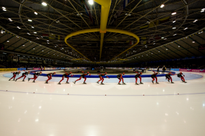
Same deal, slightly different approach to the photo. This series of shots was taken with a wide angle lens at the widest setting during Dutch Nationals in Thialf, which is where I practically live right now. It is also, by far, the best venue for taking photos since (1) the air circulation system (those yellow pipes) keep the air a balmy 15º C above freezing and (2) the white painted concrete beneath the ice (most ice tracks are slightly grey) reflects the light onto the subject very evenly. The televised events are the best, because they turn all the lights on full-power. Actually, the photoshopping here was much easier because I didn’t have to worry about the opacity of the subject at all, I just pasted her in there.
Speaking of wide-angled shots, I have become well-known (among my facebook friends, who clearly didn’t know me very well before all this) for panoramic shots. This one comes from a memorable photo shoot for the Columbia Daily Spectator, or “Spec” as it is affectionately known. The effect seen here can be achieved with something called a “fisheye” lens (apparently this is what a fish sees, whilst waiting for the subway). However, this particular photo was not taken with a fisheye lens (I didn’t own one at the time). The tell-tale way of knowing that is because the overall resolution of the original photo that I submitted was many times that of my camera, while a fisheye typically takes a perfectly circular photo which you then have to crop to get a rectangle resulting in a lower resolution.
Aside from the obvious reason – that I didn’t own a fisheye, I wouldn’t have used one anyway. You see, the article was about Amanda, the girl on the far left of the photo (you noticed her, right?). She commutes every day to-and-from Columbia, which is unusual for undergrads here because everyone is expected to live on campus. It was, therefore, important to be able to make out her face. I actually shot this with a “normal” zoom lens (not a wide one) and took 6 photos (at a 28mm focal length, if you’re interested) which I stitched together in photoshop. Recent versions of photoshop have tools that make this very easy, the thing you have to remember is that “auto” often screws things up, so the setting I used to distort the photos before blending them together was called “cylindrical” which basically bulges the photo in the middle and pinches it a bit towards the sides, depending on the focal length.
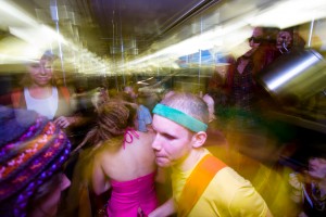
The New York Subway is such an iconic and recognized setting that some find it difficult to get a new photographic angle on it. About once a semester, the folks at Potluck House organize a party which takes place on the subway. It ordinarily gets on somewhere in the city and goes out to Brighton Beach for a skinny dip before hopping back on the subway to return home. All this usually takes place between the hours of 1am and 4am. I thought I would take my camera along, and it’s a good thing I did…
This one is a textbook example of a technique that I have recently learned is called “dragging the shutter”. This is what happens when you take a scene where you normally just use the flash as your main source of light, but hold the shutter down for a long time so that the ambient light has time to illuminate the background. On a normal point-and-shoot compact camera, the flash usually lights up (often overexposing) the subject while the background remains very dark. With an SLR and good flash (and some knowledge of how to use them both), you can get around this by (1) turning the power of the flash down and (2) holding the shutter open longer.
To achieve the above effect, I deliberately moved the camera around a bit (I promise, I hadn’t been drinking) and set the flash to synchronize with the second shutter – that means that the flash flashes when the shutter is about to close rather than when it has just opened, this doesn’t mater at all for this photo, but becomes important later. The result is the feeling of motion caused by the blur, but not of total disorientation because there is still a very sharp image in amongst all of the zany-ness.
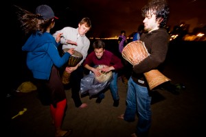
Sometimes though, there isn’t much to be gained by lighting the background. This was the case here, another photo from the subway party. After skinny dipping we played drums and sang on the beach. Taken with a normal zoom lens at the widest setting, I’ve used the distortion in the corners to not only accentuate the flying of Morgan’s hair, but also to sort-of focus the energy in the picture which is centered by the direct flash illuminating the middle. In the background, it is very dark, but for the distant lights of the city which almost look like flames in the shot.
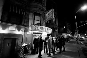
Continuing the theme of shooting late at night in New York, we have a photo of St. Nick’s pub in Harlem. Come here any night of the week, and you’ll be treated to several hours of pretty awesome jazz in a very full pub. There is a somewhat timeless quality to this photo. There really isn’t anything to it, and I could have taken this photo with any camera that has existed since about the turn of the century. I decided to make it black and white because I felt that the colours confused things and were distracting in a photo which is really about nothing more than good composition. There are no “dead spots”. The top-left corner is a bit quiet, but the art of good composition is about not making your photos too “busy”. I was trying to capture a mood here, and the long shadows, overexposed light from within the pub and stark contrasts were more important than filling the frame with every little bit of information possible. But really… I just saw this scene and thought “that looks nice” and took a photo.
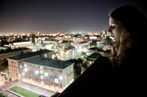
Laurel will probably kill me for including this one, although she did make it her facebook profile pic for a while, so I assume that she likes the photo. This unique view was captured from the out-of-bounds roof of the International Affairs Building at the corner of Amsterdam and 118th. The shutter was open for about 2 seconds and, for a hand-held shot of a live subject, there is almost no motion blur! I was testing my new Nikon’s low-light capabilities (verdict: unbelievably good). There are actually a number of similar shots where Laurel does different things, like look into the camera, but I liked this one the best.
As you may have surmised, I’m not a huge fan of using the flash, preferring instead to use available light. It was about 11pm in October and there wasn’t a whole lot of natural light… so I used just enough to illuminate her face (I also like how it’s illuminated from below and how there’s even some rimlight around the top of her head) which resulted in the buildings being slightly overexposed. I experimented with stopping down the aperture (this was f/2.8 – wide open) to try to get more detail out of the buildings but realized that (1) I was having enough trouble getting enough light as it was and (2) overexposed buildings out of focus looked nicer than overexposed buildings in focus. I also desaturated it a little (took some of the colour out) because I thought that the way the camera’s sensor picked up the colours in the shot was a bit too vivid, and I was going for a more subdued look, to go with the weather (who knows, if it had been a hot night, this may have been a more saturated photo).
The thing I like most about this photo is that, for those who know the Columbia Campus, it is immediately obvious what it is, despite being out of focus. The girl and the dark ledge frame the photo and give it context. I also like it because the look on Laurel’s face reflected my mood at the time, and so I probably think this photo is much better than it actually is.
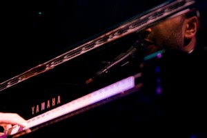
This was actually from one of my earliest assignments with the Spec. John Legend and Jeffrey Sachs got together (not like that!) to talk about poverty and how to fight it. Actually, that was mostly Jeff, John played the piano and sang a little. The only shots that ran in the paper were the “standard ones” which were mostly not-mine. I just asked myself “how many photos are there of people playing the piano” (answer: a lot) so I was trying to get a slightly different take on it. In this photo there is just enough information for you to see what is going on, yet it doesn’t look like the standard “a man playing the piano” picture. On a technical note (har har), I should’ve used a flash (although there is a chance that I was told not to) because if there’s one thing that stage lighting does that is bad for photographers, it is that is messes with your “white balance” (the balance of the intensities of red, green, and blue so that colours are reproduced correctly).
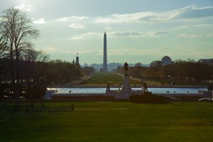
During spring break, I took a quick trip up to Washington D.C. to see if I could get the opportunity to slap George W. Bush in the face. That opportunity didn’t present itself as I had hoped, but I did get a chance to take some photos. On the point of light sources affecting your white balance, this photo is an interesting example. Sunrise and sunset are the best times to take outdoor photos because the light is really good. Overcast days are also good because the clouds diffuse the light and spread it evenly and without sharp shadows on whatever it is you’re shooting.
This photo was taken near sunset, from on the steps in front of the Capitol Building. It is difficult to tell, but this photos has undergone a huge amount of editing. For some unknown reason, the colours just didn’t want to work, so I twiddled with individual colour channels’ luminosity and saturation for hours just to get it looking like I remember it looking. Was it worth the effort? I don’t know, but this photo got published in a travel guide.
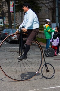
This one was just kind of cute. While in DC, I chanced on the St. Patrick’s day parade. I saw one, then the other, then I KNEW that I had to get them in the same shot (and facing opposite directions). It proved surprisingly difficult (you’ll notice that part of the front wheel of the penny farthing is out of the shot) because one of them, I’ll let you guess which one, was moving very quickly. Sometimes being a photographer is like being an army sniper, you set up your target, stalk it covertly, then shoot it at precisely the right moment. There are crucial differences of course, like your target not being dead afterwards, having an unlimited supply of ammo, and being able to dress more casually.
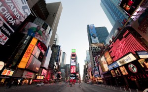
Sometimes stalking your prey is more difficult than just chasing strange things or waiting for stuff to line up. In this instance, the thing being chased is… buildings. They don’t move much, but in Times Square, everything else moves… quickly. It is surprisingly difficult to stand in the middle of Times Square at any time of the day, so I went on a fairly summer-ish day at about 5am and hoped that the sky was clear. Stalking good weather and very very early mornings can be frustrating because these factors are largely out of your control. Once the light got good, it was just a matter of putting on the wide-angle lens and using the distortion to create an over-accentuated perspective which gives the viewer a feeling of being trapped in a hole – a very brightly-lit hole, in the middle of an awesome city.
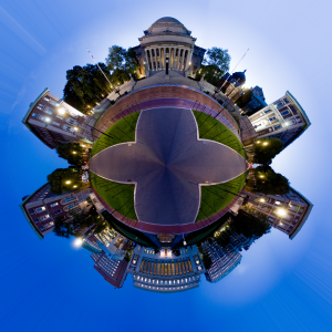
Another 5am photo-stalk. The sun is just beginning to come up, enough to light the scene, but not enough to actually cast a shadow. It also allows me to overexpose all the lights, which turned off only a few minutes after I took the photos (there’s another version of this, made up of photos taken only five minutes later… it looks completely different). The photo editing was a two-stage process, first I stitched all the photos together into a long left-right panorama using the process I described above. The final trick is to make the very long rectangle into a square (by stretching it) then “convert rectangular coordinates to polar coordinates”. For those less mathematically-inclined, it is simple – everything on the bottom edge of the photo goes to a point and everything on the top edge gets spread out over a circle. All the bits in between end up… in between, and voila! you get this. A print of this was donated to a community art auction… I don’t know if it went for much, but I did hear that it got a lot of “wow”s. (I donated an almost identical photo the year before except it was taken midday on an overcast day on the day of the first snow in December 2007… so it looked like a big snowball).
To be continued…


Leave a comment